The 10 principles of mobile interface design
Based on his workshops, mobile consultant Jonathan Stark compiles the top principles of mobile interface design and explains how to take your mobile app from concept to completed design .
When you purchase through links on our site, we may earn an affiliate commission. Here’s how it works.
No matter how you measure it, mobile is huge and growing. The convergence of cloud computing, ubiquitous broadband, and affordable mobile devices has begun to transform every aspect of our societies. Analysts predict that by 2015, mobile phones will overtake desktop computers as our primary means for accessing the internet.
In order to keep pace with this rapidly changing landscape, designers and developers – and the people who work with them – need to start thinking about mobile as a primary project goal; not something tacked onto a desktop-centric project as an afterthought.
Mobile is different
Although they are often lumped together as computing devices, smartphones and desktop computers are very different: small screen vs big screen, intermittent vs reliable connectivity, low vs high bandwidth, battery powered vs plugged in, and so on. Given this list, one might be tempted to think of mobile devices as underpowered versions of 'real' computers. But this would be a mistake.
In fact, the reverse is true: smartphones are actually more powerful than desktops in many ways. They are highly personal, always on, always with us, usually connected and directly addressable. Plus, they are crawling with powerful sensors that can detect location, movement, acceleration, orientation, proximity, environmental conditions and more.
Given the many differences between mobile and desktop computing devices, it should come as no shock that designing for mobile is very different than designing for the desktop. From my workshops, I’ve compiled a list of 10 principles of mobile interface design that help people familiar with desktop design and development unleash the unique power of the mobile platform.
01. Mobile mindset
Because of the differences between mobile and desktop, it’s imperative to get yourself into a mobile mindset before getting started.
- Be focused: More is not better. Edit your features ruthlessly. You are going to have to leave stuff out.
- Be unique: Know what makes your app different and amplify it. There are lots of fish in the sea of mobile apps. If there’s nothing special about your app, why would anyone pick it?
- Be charming: Mobile devices are intensely personal. They are our constant companions. Apps that are friendly, reliable and fun are a delight to use, and people will become quite attached to the experience.
- Be considerate: App developers too often focus on what would be fun to develop, their own mental model of the app or their personal business goals. These are good places to start, but you have to put yourself in your users' shoes if you ever hope to create an engaging experience.
02. Mobile contexts
The image of the busy professional racing through the airport with a bag in one hand and smartphone in the other is what lots of people picture when they think about mobile computing context. It is certainly one context, but it’s not the only one. To begin to put ourselves in the shoes of our users, we need to consider three major mobile contexts: Bored, Busy and Lost.
Get the Creative Bloq Newsletter
Daily design news, reviews, how-tos and more, as picked by the editors.
By submitting your information you agree to the Terms & Conditions and Privacy Policy and are aged 16 or over.
- Bored: There are a lot of people using their smartphones on the couch at home. In this context, immersive and delightful experiences geared toward a longer usage session are a great fit. Still, interruptions are highly likely so be sure your app can pick up where your user left off. Examples: Facebook, Twitter, Angry Birds, web browser.
- Busy: This is the 'running though the airport' scenario. The ability to accomplish micro-tasks quickly and reliably with one hand in a hectic environment is critical. Remember that the user will have tunnel vision in this context, so huge targets and bold design are important. Examples: TripIt, email, calendar, banking.
- Lost: Users who are in transit, in unfamiliar surroundings, or in familiar surroundings but interested in something unknown around fall into the lost category. In this context, sketchy connectivity and battery life are big concerns, so you should offer some level of offline support and be sparing with your use of geolocation and other battery hogs. Typical examples: Maps, Yelp, Foursquare.
03. Global Guidelines
Different apps call for different approaches, designs and techniques. That said, the inherent nature of a pocket-sized touchscreen device suggests several global guidelines; ie, the stuff that always matters.
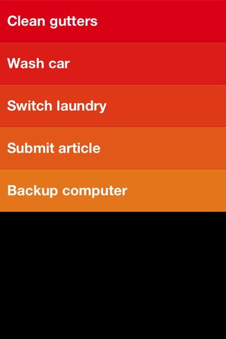 do list app that has no chrome at all; it’s pure content" width="" />
- Responsiveness: Responsiveness is absolutely critical. I can’t stress this enough. If your user does something, your app needs to acknowledge the interaction instantly. Note that responsiveness and speed are not the same thing. It’s OK if certain operations take time. Just make sure you let the user know you’re working on it.
- Polish: Polish is extremely valuable. Because of the 'constant companion' nature of our relationship to smartphones, paying a lot of attention to getting the little details perfect will be noticed and appreciated. I think of this as being like the 'fit and finish' of a car. The engine might be powerful and the body style gorgeous, but if there’s a lot of road noise or rattling on the highway, the experience will begin to degrade for the commuter.
- Thumbs: With the advent of touchscreen interfaces, everyone is always talking about 'finger this' and 'finger that'. In reality, the thumb is what we need to design for. Unless the user is interacting with her smartphone with two hands, it’s almost impossible to get a finger on the screen. And even in a two handed grip, she’s likely to type with two thumbs. Thumbs are the default.
- Targets: Look at your right thumb. Not the tip, but the face – the part that comes into contact with your phone screen. Mine is the approximate size and shape of a bottle cap. Great for a lot of things, but far from precise when it comes to targeting tiny regions of my smartphone. It seems the magic number for thumb friendly UI elements is 44 pixels. Exceptions abound, but this is a good – ahem – rule of thumb. You should also be conscious of where you place your targets relative to each other. For example, putting the Backspace button directly adjacent to the Send button in an SMS app would be a bad idea.
- Content: The revolution of touch interfaces is that they enable us to interact directly with our content. This removes abstractions (such as mouse and trackpad) and is more in line with how our brains are wired. I don’t have to look far to see the significance of this: my two-year-old can operate an iPad without difficulty but a laptop is a mystery to him. Leverage the intuitive power of touch UI by minimising interface chrome (buttons, tab bars, checkboxes, sliders and so on) wherever possible and putting your content front and centre.
- Controls: When you do have to add controls, try to put them at the bottom of the screen (in other words beneath the content). Think of an adding machine, a bathroom scale or even a computer – the controls are beneath the display. If they weren’t, we wouldn’t be able to see what was going on with the content while we were using them.Contrast this real-world design consideration with traditional web or desktop software, where navigation and menu bars are virtually always at the top. This makes sense in a mouse context because the pointer is nearly invisible. Not so with the 'meat pointer' at the end of your arm.
- Scrolling: Avoid scrolling. I can assure you that 'below the fold' exists for mobile. Also, having a non-scrolling screen has a more solid and dependable 'feel' than a scrolling view because it’s more predictable. Of course, certain screens have to scroll, but it’s good to avoid it where you can. If you think discoverability might be an issue, you can reverse animate scrollable content into its default position to give a subtle but effective indication that there is more content out of view.
04. Navigation Models
There are plenty of novel navigation models for mobile apps (Path’s radial corner nav springs to mind) but if you're going to use one of common navigation models, be sure to pick the one that makes the most sense for your app.
- None: Single screen utility apps (eg Weather app on iPhone)
- Tab bar: Three to six distinct content areas (eg Twitter for iPhone)
- Drill down: List and detail content hierarchy (eg Settings app on iPhone)
05. User input
Typing stinks even on the best devices, so you should do what you can to make it easier for your users. For example:
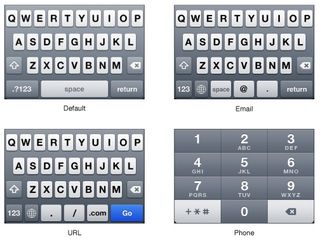
- There are about a dozen keyboard variations on popular smartphones (text, number, email, URL and so on). Consider each of your input fields and be sure to display the keyboard that will be most useful for the data entry being done.
- Auto-correct can be so hilariously frustrating that there is a website devoted to it. Consider each of your input fields and decide which auto entry options should be enabled (such as auto-correct, auto-capitalisation and auto-complete).
- If your app invites a lot of typing, you should ensure you support landscape orientation for fat-thumbed folks like me.
06. Gestures
One of the most iconic aspects of modern touch interfaces is that they support gesture-based user interaction. As cool as gestures are, there are several things you need to keep in mind:
- Invisible: Gestures are invisible, so discovery is an issue. You have to decide how to reveal their existence to the user. The most clever approach I’ve seen is on the promotional iPads mounted in Apple’s retail stores. When a page first loads, any scrollable areas do a quick 'reverse scroll' into their default position. This immediately invites a swipe or flick gesture from the user without having to explicitly indicate which areas are scrollable.
- Two hands: Multi-touch gestures require two-handed operation. I find this particularly evident in the native Maps app on iOS which uses a pinch open gesture to zoom out. When I’m traveling in a foreign city with a coffee in one hand and my phone in the other, this is an annoying limitation. Android addresses this issue by including zoom in/out buttons overlaid on the map (which means you can continue enjoying your coffee while hoofing it around London).
- Nice to have: In most cases, I consider gestures a 'nice to have' but not critical. Sort of like keyboard shortcuts – power users will love them, but most people won’t even know they are there.
- No replacement: A common vocabulary for gestures doesn’t exist yet so it’s too soon for most apps to skip visible controls that can be used with a single-finger.
07. Orientation
- Portrait is by far the most popular orientation so optimise for this case first.
- If your app invites lots of typing, you should support landscape orientation so people can access the larger keyboard.
- When orientation changes unexpectedly, it’s, well… disorienting. If you think your app will be used for long periods of time (for example, the Kindle Reader app), consider adding an orientation lock right in the app.
08. Communications

- Provide feedback: Provide instant feedback for every interaction. If you don’t, the user will wonder if the app has frozen up, or if they missed the target they were trying to hit. The feedback could be tactile (like the Android ‘thump’ vibration), or visual (highlighting a tapped button, for instance). If the user has requested an action that is going to take a long time, display a spinner or progress bar to let them know that you received their request and are working on it.
- Modal alerts: Modal alerts are extremely pushy and intrusive to the user’s flow, so you should only use them when something is seriously wrong. Even then, try to mitigate the intensity by keeping language reassuring and friendly. Remember not to use modal alerts for 'FYI' type information.
- Confirmations: When you have to ask a user to confirm an action, it’s acceptable to display a modal confirmation dialog (such as 'Are you sure you want to delete this draft?'). Confirmations are less intrusive than alerts because they are in response to a user action and therefore in context and perhaps even expected. Be sure to make the 'safest' choice the default button in the dialog to help avoid inadvertent destructive actions.
09. Launching
When a user goes back into your app after having used it previously, you should resume operations right where the user left off. This will give the illusion of speed and contribute to an overall feel of responsiveness.
If possible, the launch screen you display when the app is first loading should be a 'content-less' image of your app. Anything that looks interactive (such as buttons, links, icons, content) will create frustration by inviting failed interactions.
NOTE: Resist the temptation to place branding materials on your launch screen. They make the user feel as if they’re viewing an ad and they’ll resent you for making them sit though it. Of course, a branded launch screen doesn’t last any longer than an empty one, but the perception of delay exists regardless.
10. First impressions
- Your icon: Your icon has to compete for attention in a sea of other icons. That being the case, think of it more as the business card than an art piece. Be literal – show what your app does. Use a strong silhouette and keep text to a minimum. A polished icon suggests a polished app, so it’s worth devoting serious time and money to doing it right.
- First launch: First launch is a make or break situation. If a new user gets confused or frustrated while trying to acquaint themselves with your app, they’ll ditch it ASAP. If your app provides complex functionality, you might want to include a 'tips and tricks' overlay, or perhaps a few panels of orientation screens. Note that this is not a substitute for a good design; if you find yourself creating a lot of help text, it could indicate that your UI needs work.
Conclusion
Mobile computing represents a staggering opportunity for web designers and developers who want to become productive on mobile. Yes, there is a bit of a learning curve, but much of a web professional’s legacy experience, skills, and tools will translate nicely. Admittedly, the rate of change in the mobile world can be a bit daunting at times – but hey… at least it’s never boring.
Liked this? Read these!
- How to build a mobile website
- How to build an app
- Free graphic design software available to you right now!
- Our favourite web fonts - and they don't cost a penny
Thank you for reading 5 articles this month* Join now for unlimited access
Enjoy your first month for just £1 / $1 / €1
*Read 5 free articles per month without a subscription
